Feeling Awesomly Artistic

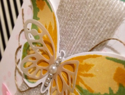
Time files when you’re having fun and this week was no exception. Before I knew it, my Wednesday Craft & Coffee class was upon me. Come Tuesday, I still had no idea what we creating or even what stamp set we were going to use, so I scoured my shelves in search of inspiration. Then I spied with my little eye my ‘Awesomely Artistic’ stamp set. I purchased this stamp set with one of my first orders when the new catalogue came out and was yet to still even mount it, let alone have used it. I don’t know why, as I think it is a very versatile and gorgeous set. I think I simply just forgot that I had it.

I remember one of the ladies mentioning at last week’s class that she loves black on a card, so that got me thinking on how I could add it to this card and use black as a feature in my class this week. Good ol’ Typeset Designer Series Paper was the was to go! My favourite colour to add with Typeset… You guessed it, Mint Macaron. Now that I had my card mapped out, it was time to play and create.

Here is what I came up with:


To compliment the card and add another aspect to the class that we hadn’t used before, we created a co-ordinating ‘Mini Treat Bag’


I love how cute this little bag is. Big enough to add something special to the inside and small enough to still be manageable, to add a gift card, some sweets or even adhere it to the front of a card!


I hope you have enjoyed this week’s class creations. My classes are held every Wednesday apart from school and public holidays at Vintage Graffiti HQ. All are welcome, so drop me an email for some more information or if you’d like to come along vintagegraffiti@hotmail.com.

Don’t forget to also check out this week’s Weekly Deals. I have listed them below. There are some great bargains to be had. Just click on the picture of the product you are interested in or here if you wish to place an order. The Hostess Code for this month is: KQSUEQEF

Happy stamping,
From your favourite Vintage Graffiti Artist,
Emma xo

Product List 

You Warm My Heart 

Yesterday, like almost every Wednesday, between 10am and 12 noon, I hold my usual Craft & Coffee class. I love having my group of ladies over every week, sharing with them what I love. I look forward to Wednesdays every week and I try and have something a little bit fun for them to do at each class. And each class varies. We don’t have a set theme.

This week though, I wanted to do something out of the box from your standard, fold open card. This week I wanted to try “fancy folds”. I don’t often do fancy fold cards, so this was something new for me and my ladies! A pop out swing card.

  
I had seen the basis on what I wanted to achieve on the internet and then I tried Google for a tutorial. I found the fabulous Julie Davison’s blog and a tutorial on there as well. Although, this didn’t suit Australian sized cards, I adapted the tutorial, changed it all around a bit and viola, my Vintage Graffiti version made using our Sheltering Tree photopolymer stamp set and our new Lots Of Labels Framelits.


It is a little bit tricky to take a photograph of this style of card but I did my best and I hope that you can see the design. I am so happy with how it turned out. One fancy fold design that I will definitely make again, and once you have the hang of it, not to fiddly either.

A little bit of bling and some sequins in the tree, a punched out love heart, some thread and a Naturals Expressions word and the card is accessorised and finished and looks glorious. Even if I do say so myself.


There wasn’t enough time in the class to create two fancy fold card but still enough time to squeeze another project in, so continuing with the same stamp set and colour schemes, we whipped up a second, and also just as beautiful card.

Some Blushing Bride sequins and Metallic Thread for a little bit of glamour and some crochet trim for a little bit of vintage and the card is finished. I love the combination of these accents together.

Now, at the moment, here, at my home, it is gloomy, cold and pouring with rain.


This photo was taken at 2.30pm in the afternoon and the weather has gotten worse since then. So, with a cup of tea in hand, the open fire raring, and this blog post finished, I think it’s a perfect afternoon to spend crafting. Don’t you? I have prep to do for next week’s class and also for my team day on Sunday afternoon. A small get together where we will do a few Make & Takes, learn a few techniques, have a chat, do some business stuff, give away some prizes and all in all have a fun filled afternoon. Want to come along to my Team Days? Well, why not have a look at becoming part of my team? You’ll find a wealth of information here or again, if you wish to jump straight in (and why wouldn’t you? There is nothing to loose and everything to gain), you can do so here.


Happy stamping,

From your favourite Vintage Graffiti artist,

Emma xo

Product List

Anything Goes With CASE-ing The Catty

Helllllooooo everybody!!!

It’s been a crazy week here at Vintage Graffiti HQ with a Catalogue Launch Kitchen Tea to celebrate the release of our new 2015/2016 Annual Stampin’ Up! catalogue and also the ‘release day’ of the fabulous new 2015/2016 Stampin’ Up! Annual Catalogue on June 2nd. Finally, it’s here!

There has been quite a bit of fuss and excitement over this new release (as there always is)  and to celebrate it’s arrival, the CASE-ing The Catty Crew have been asked to feature anything from the catalogue that caught our eye when they first flicked through the catalogue!!!

You may have come here from the inspiring Jackie Noble’s blog or started from here, at my blog. Either way, enjoy your journey via the CTC Crew’s blog posts!

This week we are celebrating anything that caught our eye when we first saw the new Annual Catalogue. Flipping through it’s glorious 189 pages, my first choice had to be the beautiful ‘Watercolour Wings’ photopolymer stamp set and matching ‘Bold Butterfly’ Framelits on page 75! How can you go past these big, bold and beautiful butterflies combined with all things “in” at the moment which is definitely watercolour?! You just can’t! (And, seriously, how cute is that small butterfly Framelit!)

The gold twine and the cute little staple combined with the subtlety of the vellum and the bold colours of the butterfly really make this card special. Don’t you think?

My inspiration was to CASE the simple and lovely card at the top left of the page. We all love cards that look absolutely stunning and only take a few minutes to make. With the Watercolour Wings stamp set, this is definitely achievable. Great when you have multiple cards to make and not much time. And the Framelits make cutting it all out so much easier.

Now, I love simple. I do. But sometimes a card is just screaming out to be ‘”stepped up”! This was one of those cards. And even though I do love the card in the catalogue, I had to put my spin on it and create a Vintage Graffiti version.

I love to always try and matt my cards if I can and this one was no exception. Grabbing my new favourite colour (and we all know what this is by now, don’t we?), which also featured in my watercolour butterfly (even though layered with the yellows, it comes across as a much more vibrant green colour), I used it as the base of my card. And layered the Whisper White layer on top using Stampin’ Dimensionals. This always helps a card look a bit more detailed.

What do you think of my “stepped up” version?

I left the little stamped Pink Pirouette dots as the background as I love the delicate look they gave. These also featured in the first card. I also stepped up my card by adding some texture with our white jute ribbon and turning it into a banner and some loopy linen thread. Some basic pearls added to the body really set the butterfly off.

Once again, thank you for taking the time to look and read my blog. The next blog in the hop is Bronwyn Eastley. She had something really spectacular in store for you so quickly head on over!!!

Happy stamping,
From your favourite Vintage Graffiti artist,
Emma xo

Product List

Getting Subtle With Build A Birthday

Pinterest.

My best friend and my worst enemy.

Who hasn’t lost hours and hours of their day scrolling through this magical world on the internet, searching, finding and pinning those perfect, must try, can make, be sure to create, will cook, pictures, links and instructions to all those magical items out there in the world wide web?! Me. I can be one of those people.

So, while hopping on Pinterest the other day (just to have a quick look ;)), I was instantly inspired by two pictures. They caught my eye and I knew that these fabulous creations had to have their ‘Vintage Graffiti’ twist added to them. The first was a card and colour combination by Leena Girsa and the second, a card design created by Lyssa Zwolanek. Both using the ‘Build A birthday’ stamp set.

The subtlety of the colours are were what drew me to the first design. And as I also have a slight addiction to the new In Color Mint Macaron. I couldn’t resist. How beautifully does it look paired with Blushing Bride, Smoky Slate, Tip Top Taupe and a hint of silver for good measure?


I’ll let you in on a little secret. I don’t mind a little fussy cutting every now and then.

Ok, ok, I always like fussy cutting. Much to the dread of the ladies that come to my classes as most cards usually contain this feature. I love that by fussy cutting, you can really make an element of the card ‘pop’! In this card, I fussy cut the teeny tiny bunting and adhered it to the top of my cake using Stampin’ Dimensionals. I do believe, it finishes off the cake nicely. Don’t you?


Also inspired by the talented Jessica Williams over at The Paper Caper, I unravelled the silver element from our silver Baker’s Twine and created a little bit “crazy” behind my banner. This addition to the card makes it a little less formal and a bit more fun.

Now, with the addition of the brand new ‘Metallic Thread’ in the catalogue, I will never have to unwind my Baker’s Twine ever again! (And yes, I have that on my new order. I can’t wait to receive all 45.7 metres of it – for just $5.25, what a bargain).

This card colour combination and design would also make a wonderful wedding or engagement card. Oh, the possibilities are endless.


I was in love with the design for my second card from the moment I saw it and I knew that this colour combination and the addition of the Vintage Faceted Designer Buttons would compliment each other so well. The addition of some bling to the flames of the candles just make his card a little more fun.

We have gone from birthday cakes to birthday candles. I love how this set is so versatile.

Whist I am here blogging, I thought I’d also inform you about this week’s  Stampin’ Up! Weekly Deals. These deals run from Wednesdays until 11.50pm the following Tuesday night and usually contain at least 25% off selected Stampin’ Up! products. Check them out in the photos below. Awesome!

You can never have to many adhesive refills so I must add some more Fast Fuse to my order. How are you on consumables? Need some more adhesives? Whisper White cardstock? You can always order via my online store here anytime, day or night. Don’t forget to add this month’s Hostess Code if you do though GMSMM7DK. Thank you kindly.

The products I have used to make today’s cards are also listed below.

Happy Stamping,
From your favourite Vintage Graffiti Artist,
Emma xo

Product List

You’ve Got This : A Sneak Peak For The TGIF Sketch Challenge

Yippee!

I am quietly doing a little happy dance! Yesterday, my pre-order for the new 2015-2016 Annual Catalogue arrived at the post office. Being in a rural country town means I don’t get door to door deliveries. So, after anxiously awaiting the postie’s delivery, I rushed out to the letterbox to see if the long awaited parcel pick-up slip was in there… Low and behold, it was and I had it in my hot little hands. I was lucky enough to be home when it arrived, so I jumped into my car and straight to the Post Office I scurried.

One trolley and two BBB (Big Brown Boxes) later, my car was packed and excitedly (and carefully), I drove home. I just couldn’t wait to see the items in real life. Missing out on the Stampin’ Up! Convention this year meant that this was going to be my first experience at seeing the pre-order products up close and personal and have a real life copy of the brand spanking new catalogue in my hot little hands!!! What to open first?! The catalogues it was, as I knew once I opened up the other box containing the new stamps and inks etc., I would be lost forever. Catalogues opened, checked off and labelled… Thank goodness that was done in a timely manner.  Eep, now to the other BBB.

Upon opening it, on top was my very own copy of the new catalogue. I had a slight glance, a flick and popped it aside. I can look at that in bed later. One by one, as I pulled out my new goodies, there were quiet oohs and aahs and every so often, a louder “Oh my”. Lucky no one was home or they might’ve thought I was going completely mad. The 2015-2017 In Colors… WOW! I think I have already got my new favourites. The lace, so soft and delicate. The new 6×6 Cherry On Top DSP stack, so bright and fun. Perfect for birthdays and party themes. I could go on forever! But, you’ll have to wait and see for yourself when the catalogue goes live on June 2nd, 2015 or at my Catalogue Launch Kitchen Tea where you will get your very own copy of the new catalogue and also see some new and fabulous items up close and personal! Want to pre-order your very own copy of the new Annual Catalogue? Why not leave me your email in the comments and I’ll be in contact.

I was overwhelmed with all the new products and didn’t know where to start. Then I remembered the new TGIF Challenges blog where I thought I’d find some inspiration. And right I was. A sketch challenge. One of my favourite type of challenges. I had missed completing their first ever challenge, I wasn’t going to miss this one! Here is the challenge:

TGIF Challenges 02

One of my favourite stamp sets that was on pre-order was the gorgeous ‘You’ve Got This’ set containing a beautiful flower, background stamp and lovely greeting stamps in a gorgeous cursive script. This is the one that was going to get inky first! And from the get-go, I knew that Tip Top Taupe and Mint Macaron were going to be a match made in heaven, so I knew that they would also feature. Inspiration : check, stamp set : check, colours selected : check. Now to get crafty! An hour or so and a lot of fun later, here is my entry:

A pop of colour with a Watermelon Wonder 2015-2017 In Color Blossom Accents

I adore how the silver heat embossing shines and reflects the light. Gives the card a bit of elegance, don’t you think?

Close-up of the Tip Top Taupe Dotted Lace Trim. So soft and easy to work with. A perfect accent to any creation.

The Blender Pens colour beautifully and give a lovely watercolour look to the flower without the need to be neat and perfect.

I love how the background stamp that comes with this set gives the linen look without being too overpowering. I can see that this particular stamp is going to get a work out!

Also, a little reminder about this week’s Weekly Deals and also the Retiring List. All while stocks last. You can shop for these items and also shop for most of the supplies that I used to create this project here.

Happy crafting,
From your favourite Vintage Graffiti Artist,
Emma x

Stampin’ Up! supplies used for this project:

Product List