Getting Inky In Class

Wednesdays are one of my favourite days of the week! Not only is it hump day which means that the weekend isn’t too far away, but it is also Craft & Coffee day! Where my lovely group of ladies, whom quickly became friends, come over for a crafting session for a few hours in the morning. We chat, drink hot drinks, laugh and most importantly (and fun), we create. I usually like to showcase a new technique, feature a fancy fold card or a new stamp set or create a 3D item at these Wednesday sessions although I am slowly but surely running out of fun ideas to use.

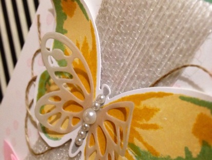
Not this week, thanks to my super talented friend and fellow Stampin’ Up! team member Jess over at The Paper Caper. Jess recently featured an inky card over on her blog and I knew that I just had to get myself and my ladies inky also and create our own versions of Jess’ awesome card!!!


Now, I did warn my ladies before the class that they would get inky, and inky they did get. Hands, fingers, and I even managed to drip some Pumpkin Pie on my jeans. And it was lots of fun. Watching them all have a blast creating with water, sponges and re-inkers. It was almost like being in Kindergarten again. Sploshing and splotching on paper to create a beautiful masterpiece.


With this technique, I love how each and every single person’s card came out differently. Even though we all used the same technique and the same colours etc., the inky sponges did whatever they wanted and created some beautiful, artistic patterns.

It’s been a long time since I was in Kindergarten, and this brought back some wonderful memories, so I think I will definitely be getting messy again (maybe not with Blackberry Bliss as my nails are still stained two days later LOL) but am definitely going to try some new, fun things in my creations. Thanks Jess for getting me back to basics!

Happy stamping,
From your favourite Vintage Graffiti artist,
Emma xo

Product List

Anything Goes With CASE-ing The Catty

Helllllooooo everybody!!!

It’s been a crazy week here at Vintage Graffiti HQ with a Catalogue Launch Kitchen Tea to celebrate the release of our new 2015/2016 Annual Stampin’ Up! catalogue and also the ‘release day’ of the fabulous new 2015/2016 Stampin’ Up! Annual Catalogue on June 2nd. Finally, it’s here!

There has been quite a bit of fuss and excitement over this new release (as there always is)  and to celebrate it’s arrival, the CASE-ing The Catty Crew have been asked to feature anything from the catalogue that caught our eye when they first flicked through the catalogue!!!

You may have come here from the inspiring Jackie Noble’s blog or started from here, at my blog. Either way, enjoy your journey via the CTC Crew’s blog posts!

This week we are celebrating anything that caught our eye when we first saw the new Annual Catalogue. Flipping through it’s glorious 189 pages, my first choice had to be the beautiful ‘Watercolour Wings’ photopolymer stamp set and matching ‘Bold Butterfly’ Framelits on page 75! How can you go past these big, bold and beautiful butterflies combined with all things “in” at the moment which is definitely watercolour?! You just can’t! (And, seriously, how cute is that small butterfly Framelit!)

The gold twine and the cute little staple combined with the subtlety of the vellum and the bold colours of the butterfly really make this card special. Don’t you think?

My inspiration was to CASE the simple and lovely card at the top left of the page. We all love cards that look absolutely stunning and only take a few minutes to make. With the Watercolour Wings stamp set, this is definitely achievable. Great when you have multiple cards to make and not much time. And the Framelits make cutting it all out so much easier.

Now, I love simple. I do. But sometimes a card is just screaming out to be ‘”stepped up”! This was one of those cards. And even though I do love the card in the catalogue, I had to put my spin on it and create a Vintage Graffiti version.

I love to always try and matt my cards if I can and this one was no exception. Grabbing my new favourite colour (and we all know what this is by now, don’t we?), which also featured in my watercolour butterfly (even though layered with the yellows, it comes across as a much more vibrant green colour), I used it as the base of my card. And layered the Whisper White layer on top using Stampin’ Dimensionals. This always helps a card look a bit more detailed.

What do you think of my “stepped up” version?

I left the little stamped Pink Pirouette dots as the background as I love the delicate look they gave. These also featured in the first card. I also stepped up my card by adding some texture with our white jute ribbon and turning it into a banner and some loopy linen thread. Some basic pearls added to the body really set the butterfly off.

Once again, thank you for taking the time to look and read my blog. The next blog in the hop is Bronwyn Eastley. She had something really spectacular in store for you so quickly head on over!!!

Happy stamping,
From your favourite Vintage Graffiti artist,
Emma xo

Product List