CTC#63 | Giggle Greetings Meets It’s My Party

IMG_4856

This week with CASE-ing The Catty, we are to be inspired by the ‘It’s My Party’ section of the Handmade From The Heart catalogue. This suite spans from pages 3-7 and is filled with the brightest and most fun creations. There is definitely a lot to be inspired by.

  
I was inspired by the design and colours of the card on page 6 and although I don’t have any stamp sets from this suite, I do have the fun washi tape { I love the balloons } and the matching bold Baker’s Twine { Isn’t the combination of the pink and black fabulous? } .

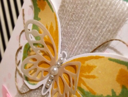
Scouring my shelf of stamp sets, I knew immediately which one I was going to pick. One that suited the fun theme and the bright colours and suited the design perfectly… Giggle Greetings. A really great but underutilised set from my collection. And I love how the card turned out!

Using the washi tape on the background instead of Designer Series Paper { DSP } is a great way to get a DSP effect and getting the most from your products. Washi tape isn’t just for sticking things down or adding an accent pop of colour.

To finish off the card, instead of using the Whisper White Baker’s Twine as they have done in the original, I used the Melon Mambo and Basic Black combo twine from the Combo Pack. The colours sure do pack a punch!

Thanks for visiting the CASE-ing The Catty blog hop this week. Be sure to play along with our challenges. You can get all the details and add your craft creation here.

To pop back over to Miss Jessica’s blog, just click on the ‘previous blog’ button or to continue on to the next CASE-ing The Catty blog, which is the very talented Miss Rachel, just click onto the ‘next blog’ button.

IMG_4857-0

IMG_4858

Happy stamping,
From your favourite Vintage Graffiti artist,
Emma xo

Product List

A Pennsationals Blog Hop | Colour Challenge

pennsationalsWelcome everybody to the very first and start of the Pennsationals Monthly Blog Hop!

What is a ‘Pennsationals’ you may ask? It is the three levels of Stampin’ Up! Demonstrators under our fabulous upline Tracy Penn who is a friend, mentor and inspiration to us all. And as we have many talented ladies in our team who blog and have blogs, we have gathered together to present for you a monthly blog hop to share with you our creations. It is fun and fabulous and helps us come together, create, share and grow closer even more as a team.

Our stunning colours this week are the combination of Island Indigo, Blackberry Bliss, either gold or silver (who can resist a bit of shiny lol) and of course, your neutrals consisting of either one or all of Basic Black, Whisper White, Very Vanilla, Kraft and Crumb Cake.

pennsationals colour challengeWhile I love all these colours separately, I rarely use them together so it was nice to create and do a combination that is a little different for me.


Next on the hop is my friend, team mate and always amazing, Rebecca Scurr – The Paper and Stamp Addict.pennsationals next blog

If you get lost upon your way on your Pennsationals Blog Hop, here is a list of participants to get you back on track. Enjoy the journey!

Emma Palonek – Vintage Graffiti    <— You are here
Rebecca Scurr – The Paper and Stamp Addict
Tracy Penn – Pennsationals
Mel Pagano – My Paper Oasis
Jessica Williams – The Paper Caper

Thanks for visiting and happy stamping,
From your favourite Vintage Graffiti artist,
Emma xo

Product List


A Whole Lot Of Thanks with CASEing The Catty

This week it’s all about thank you cards with the CASEing The Catty Crew.

You may have come here from Monique’s blog or straight from the CASEing The Catty blog and the next very talented demonstrator on your journey is my gorgeous friend and very talented lady, Miss Rebecca, The Paper and Stamp Addict!

A thank you card is a style of card that should be sent more. Everyone loves receiving happy mail, so why not make somebody’s day and send them a card? A thank you for being my friend, my neighbour, for being there, or a thank you for just being you!

This week, I’ve decided to CASE the card in the bottom left of page 13 with a little of the bottom right thrown in for good measure. I was having great trouble picking which card to recreate for this post as they are all so beautiful.

Bottom left card on page 13 from the Stampin’ Up! Annual Catalogue and my CASE for this hop.

With my new ‘Endless Thanks’ stamp set that Stampin’ Up! has out at the moment, this a perfect opportunity to use it! With so many combinations, the ways to use it are ‘endless’. (See what I did there?!)


Again, I immediately am drawn to Mint Macron to start my card. Is there any other colour on my palette now? I think not…


I love the mini clothesline pegs for that little bit of an extra special detail. And with a combination of gold and silver pegs in the pack, you are sure to find one to suit your card.


Also, to tie in with the little silver accents of the washi tape and the peg, I added some more silver to the bottom of the card.

Just a reminder to go on over to the next beautiful blogger on your journey, Rebecca. And boy, once again, she has made something lovely for you all!

Happy stamping,
From your favourite Vintage Graffiti Artist,
Emma xo

Anything Goes With CASE-ing The Catty

Helllllooooo everybody!!!

It’s been a crazy week here at Vintage Graffiti HQ with a Catalogue Launch Kitchen Tea to celebrate the release of our new 2015/2016 Annual Stampin’ Up! catalogue and also the ‘release day’ of the fabulous new 2015/2016 Stampin’ Up! Annual Catalogue on June 2nd. Finally, it’s here!

There has been quite a bit of fuss and excitement over this new release (as there always is)  and to celebrate it’s arrival, the CASE-ing The Catty Crew have been asked to feature anything from the catalogue that caught our eye when they first flicked through the catalogue!!!

You may have come here from the inspiring Jackie Noble’s blog or started from here, at my blog. Either way, enjoy your journey via the CTC Crew’s blog posts!

This week we are celebrating anything that caught our eye when we first saw the new Annual Catalogue. Flipping through it’s glorious 189 pages, my first choice had to be the beautiful ‘Watercolour Wings’ photopolymer stamp set and matching ‘Bold Butterfly’ Framelits on page 75! How can you go past these big, bold and beautiful butterflies combined with all things “in” at the moment which is definitely watercolour?! You just can’t! (And, seriously, how cute is that small butterfly Framelit!)

The gold twine and the cute little staple combined with the subtlety of the vellum and the bold colours of the butterfly really make this card special. Don’t you think?

My inspiration was to CASE the simple and lovely card at the top left of the page. We all love cards that look absolutely stunning and only take a few minutes to make. With the Watercolour Wings stamp set, this is definitely achievable. Great when you have multiple cards to make and not much time. And the Framelits make cutting it all out so much easier.

Now, I love simple. I do. But sometimes a card is just screaming out to be ‘”stepped up”! This was one of those cards. And even though I do love the card in the catalogue, I had to put my spin on it and create a Vintage Graffiti version.

I love to always try and matt my cards if I can and this one was no exception. Grabbing my new favourite colour (and we all know what this is by now, don’t we?), which also featured in my watercolour butterfly (even though layered with the yellows, it comes across as a much more vibrant green colour), I used it as the base of my card. And layered the Whisper White layer on top using Stampin’ Dimensionals. This always helps a card look a bit more detailed.

What do you think of my “stepped up” version?

I left the little stamped Pink Pirouette dots as the background as I love the delicate look they gave. These also featured in the first card. I also stepped up my card by adding some texture with our white jute ribbon and turning it into a banner and some loopy linen thread. Some basic pearls added to the body really set the butterfly off.

Once again, thank you for taking the time to look and read my blog. The next blog in the hop is Bronwyn Eastley. She had something really spectacular in store for you so quickly head on over!!!

Happy stamping,
From your favourite Vintage Graffiti artist,
Emma xo

Product List

Watercolour Wonder-ing If I Can Do It

Inspiration comes from everywhere. And while I was quietly scouring online, I kept seeing cards, scrapbook pages and the such made with their own backgrounds and unique inky look and I was instantly in love! A little bit more scouring and I discovered that it was a ‘watercolouring technique’ that was being used solely using stamps, ink pads and of course, water.

I knew I just had to give this technique a go. And for my first try, I’m quite pleased with how it all turned out.

Totally In Love

The water colouring technique is quite simple and gives a dramatic effect. Simply spritz a piece of watercolour paper with water and then stamp with your selected stamp set (I used Mum’s Love from the current Occasions Catalogue for my design) as per normal. The image will bleed and run as it desires creating a beautiful design. You have no control of hat your design is going to do, so sit back and enjoy the spectacle and randomness of it all. I started with the lighter colours, layering and stamping and finishing of with the darker images. Once you are happy with our design, set aside to dry or you can speed up the process as I did and use a heat gun.

The bold colouring of the Blackberry Bliss ink perfectly balanced with the subtle tones of Soft Sky and Wild Wasabi

I can definitely see me using this technique a lot more in my designs, cards and classes in the future.

The addition of the punched Blackberry Bliss flower and the Basic Rhinestone are the perfect accompaniment along with the punched leaves from the Bird Builder punch.

The bold colours and the watercolour technique needed to be balanced and finished off with something just as beautiful. A hand punched flower with the Petite Petals punch and a heat embossed greeting from the And Many More stamp set on some vellum did just the trick. And, of course, you can never have too much bling!

A close up of the white heat embossed sentiment on the muted vellum paper.

Thank you for taking the time to look at my blog. Keep updated with all the Vintage Graffiti happenings here and  also over on my Facebook page which you can find here.

Happy stamping,
From your favourite Vintage Graffiti Artist,
Emma xo

Love this project? Here are the supplies that I used. You can purchase all of these over at my store here.