Helllllooooo everybody!!!
It’s been a crazy week here at Vintage Graffiti HQ with a Catalogue Launch Kitchen Tea to celebrate the release of our new 2015/2016 Annual Stampin’ Up! catalogue and also the ‘release day’ of the fabulous new 2015/2016 Stampin’ Up! Annual Catalogue on June 2nd. Finally, it’s here!
There has been quite a bit of fuss and excitement over this new release (as there always is) and to celebrate it’s arrival, the CASE-ing The Catty Crew have been asked to feature anything from the catalogue that caught our eye when they first flicked through the catalogue!!!
You may have come here from the inspiring Jackie Noble’s blog or started from here, at my blog. Either way, enjoy your journey via the CTC Crew’s blog posts!
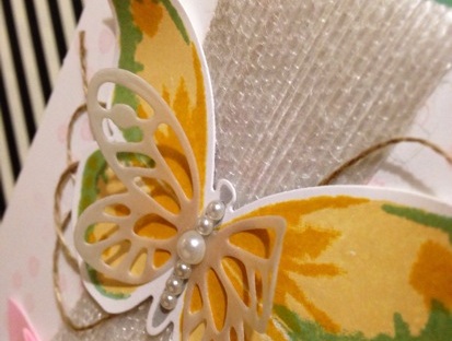
This week we are celebrating anything that caught our eye when we first saw the new Annual Catalogue. Flipping through it’s glorious 189 pages, my first choice had to be the beautiful ‘Watercolour Wings’ photopolymer stamp set and matching ‘Bold Butterfly’ Framelits on page 75! How can you go past these big, bold and beautiful butterflies combined with all things “in” at the moment which is definitely watercolour?! You just can’t! (And, seriously, how cute is that small butterfly Framelit!)

The gold twine and the cute little staple combined with the subtlety of the vellum and the bold colours of the butterfly really make this card special. Don’t you think?
My inspiration was to CASE the simple and lovely card at the top left of the page. We all love cards that look absolutely stunning and only take a few minutes to make. With the Watercolour Wings stamp set, this is definitely achievable. Great when you have multiple cards to make and not much time. And the Framelits make cutting it all out so much easier.

Now, I love simple. I do. But sometimes a card is just screaming out to be ‘”stepped up”! This was one of those cards. And even though I do love the card in the catalogue, I had to put my spin on it and create a Vintage Graffiti version.
I love to always try and matt my cards if I can and this one was no exception. Grabbing my new favourite colour (and we all know what this is by now, don’t we?), which also featured in my watercolour butterfly (even though layered with the yellows, it comes across as a much more vibrant green colour), I used it as the base of my card. And layered the Whisper White layer on top using Stampin’ Dimensionals. This always helps a card look a bit more detailed.

What do you think of my “stepped up” version?
I left the little stamped Pink Pirouette dots as the background as I love the delicate look they gave. These also featured in the first card. I also stepped up my card by adding some texture with our white jute ribbon and turning it into a banner and some loopy linen thread. Some basic pearls added to the body really set the butterfly off.

Once again, thank you for taking the time to look and read my blog. The next blog in the hop is Bronwyn Eastley. She had something really spectacular in store for you so quickly head on over!!!
Happy stamping,
From your favourite Vintage Graffiti artist,
Emma xo
Product List
- Watercolor Wings Photopolymer Bundle
- Whisper White A4 Card Stock
- Mint Macaron Classic Stampin’ Pad
- So Saffron Classic Stampin’ Pad
- Crushed Curry Classic Stampin’ Pad
- Smoky Slate Classic Stampin’ Pad
- White Vellum A4 Card Stock
- Handheld Stapler
- Gold Baker’s Twine


Gorgeous work as always Emma!
LikeLiked by 1 person
Thank you Mel.
I’m delighted to have some new goodies to play with over the long weekend ❤️
LikeLike
You are so lucky to have your order and get to have this stamp set in your hands already. Love what you created by stepping up the card.
LikeLiked by 1 person
I like your stepped up version Emma, but I must say I love your 1st card for its simple elegance. That butterfly is sure to be a hit this catty!
LikeLiked by 1 person
Love both but the stepped up version has such great texture. beautiful colours Emma
LikeLiked by 1 person
Absolutely gorgeous!!! I adore that butterfly and I really like your do-over card. 🙂
LikeLiked by 1 person
Totally gorgeous card and I am totally jealous you have your order already! When mine arrives I would love to CASE this card too! Hopefully on Tuesday!
LikeLiked by 1 person
I hope your BBB arrives this week Julia and you’ve had a play with all your new goodies! Emma ❤️
LikeLike
This is butterfly love in overload! So pleased you’ve got to play with some new product. Gorgeous CASE.
LikeLiked by 1 person
Wow, thank you for your kind comments Bronwyn. Nothing like new products to get the creative juices flowing!
LikeLike